

The original book cover design
In 1957 Stevie Smith’s poem ‘not waving but drowning’ was included in a collection of her poems of the same title.
The poem itself is short, appears to ignore some ‘rules’ of poetry, and is deceptively simple.
The original book cover design for this collection was also minimal, featuring an ink illustration by the author of a figure holding a dagger above their head.
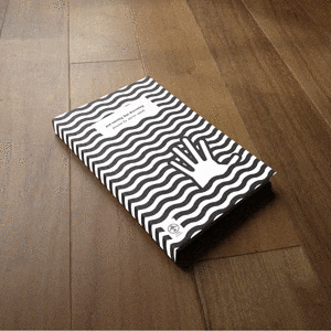
My updated book cover design concept
I have created a minimal, clean, graphic book cover design consisting of a repeating black wave pattern with an outline of a simplistic hand shape emerging from the waves and disrupting the pattern.
In my concept, perhaps the depiction of a hand reaching from beneath the waves removes some of the ambiguity associated with Smith’s ‘not waving but drowning’ piece, but the black-and-white pattern of the reimagined minimal book cover design does reflect the simplicity of the poem.
I have used the original publisher’s (Andre Deutsch Ltd) logo on the new book cover design concept without permission and any rights with regards to their trademark remain with them. Andre Deutsch is an imprint of Carlton Books.
The Book Cover Design Mockup Creation Process
The mockup itself was created from a photograph of a plain-cover hardback sketchbook on a wooden floor. Using adjustment layers in Photoshop, the colours and levels were adjusted to make the book design contrast more with the background and also reduce the red of the wood.
A vector shape was created, tracing the shape of the front cover and spine. The blending mode was set to ‘screen’ to lighten the texture of the book. The cover artwork was then imported and converted in to smart objects, which were then distorted with the ‘transform > distort’ tool to match the vector shape. The smart objects were placed above the vector shape layer which was then applied as a vector mask.
Smart objects were used so that if the artwork was ever changed, it would update in the mockup without having to re-distort or reposition it. Also, if I wish to use this mockup again for a different project, I only have to change the artwork in the smart object without having to make adjustments.
This was my first attempt at creating a smart object Photoshop mockup. I normally rely on third-party mockup templates. Despite the versatility of using a smart object mockup, I will still start from scratch next time so I can create a better one, learning from any mistakes made in this initial attempt. For example, I would use a different angle and background for the source photo.